Overview
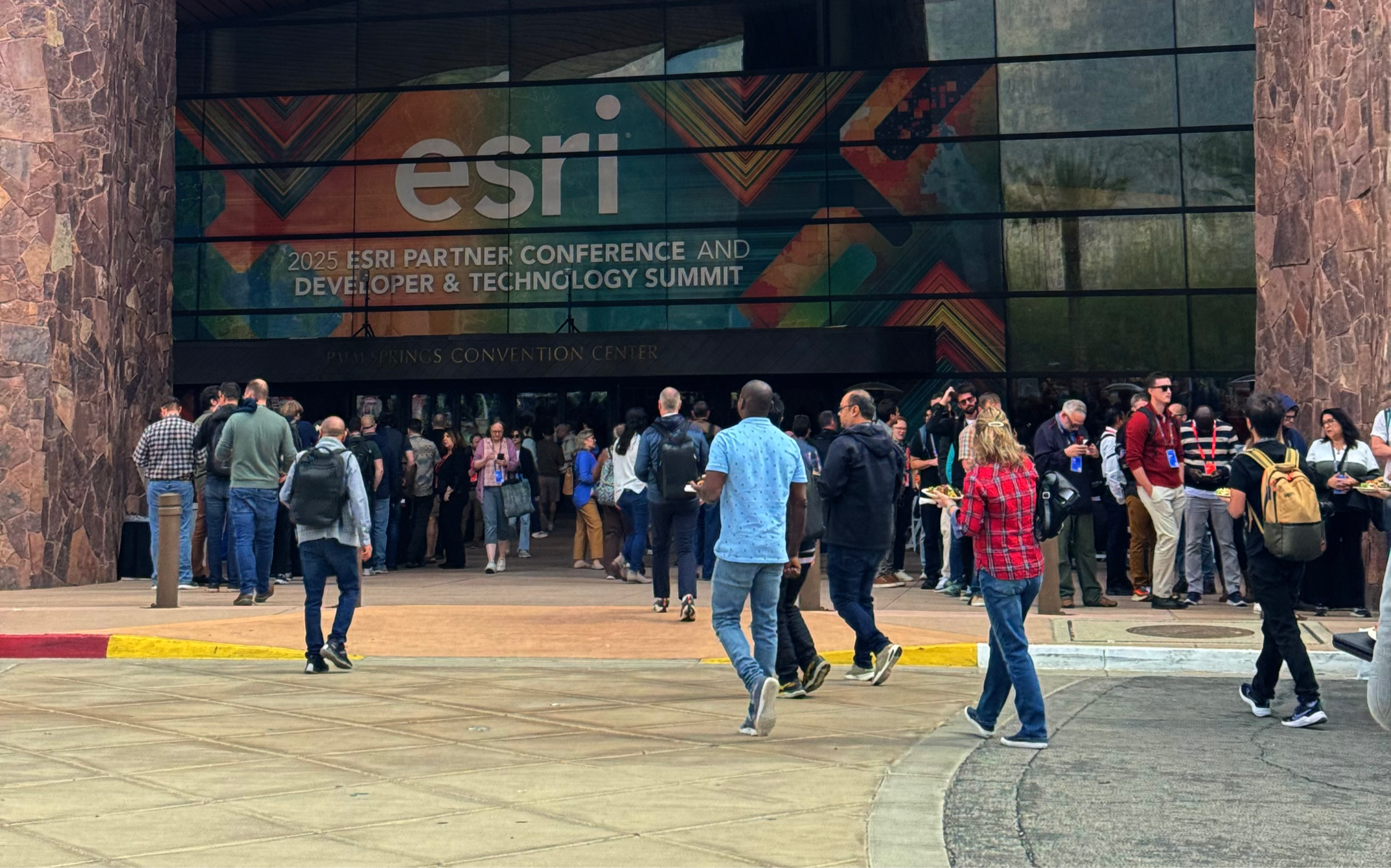
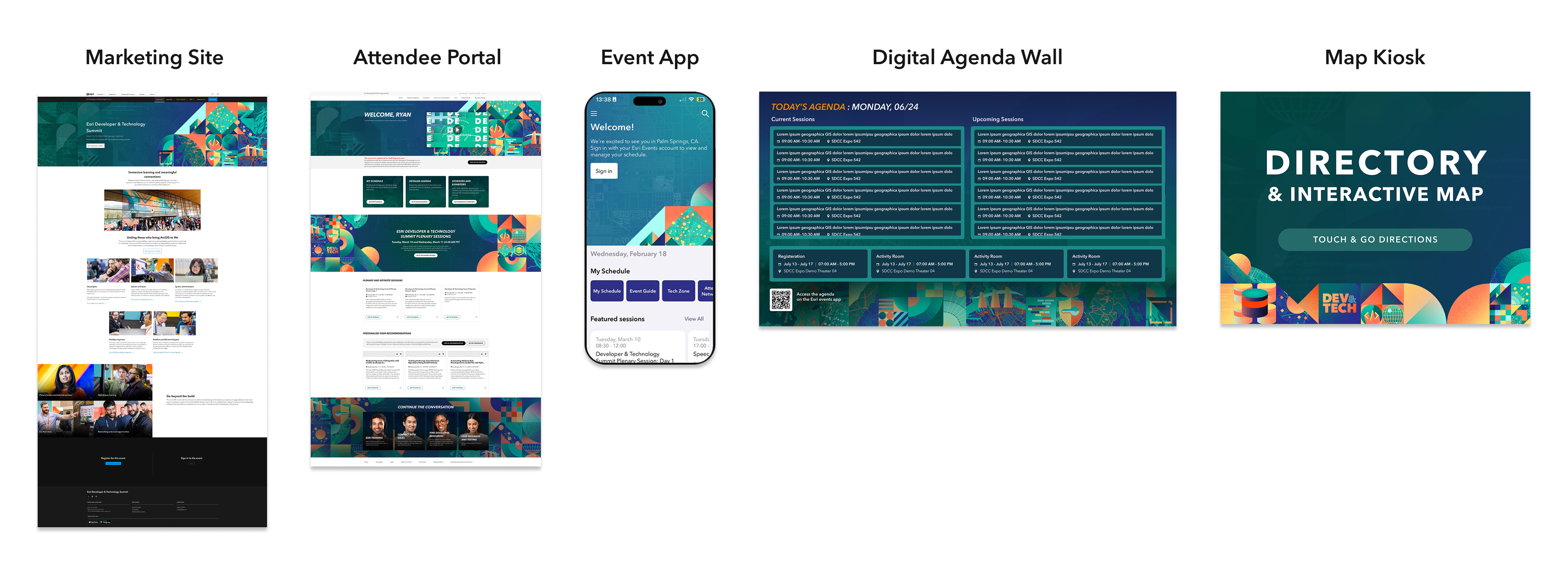
The Event Overview page is often the first interaction attendees have with an Esri event after arriving on the marketing website. It serves as the entry point for discovering what the event offers, who it's for, and where to go next.
Over time, Esri's events evolved significantly. New experiences—including hands-on workshops, networking opportunities, expos, plenary sessions, sponsor programs, and interactive experiences like the Map Gallery—became central to the attendee experience. However, the reusable Overview template had not evolved alongside them.
Rather than redesigning a single event website, this project focused on modernizing the reusable Event Overview template used across Esri's event portfolio. The redesigned template was gradually rolled out as each event launched its new marketing website, creating a more consistent and scalable foundation for future events.
The Challenge
The existing template had become increasingly difficult to maintain as event content expanded.
Because there were no dedicated areas to showcase newer event experiences, stakeholders began repurposing existing components to communicate information they were never designed to support. A single four-tile component became responsible for promoting everything from sponsor and exhibitor information to related events, audience messaging, and event highlights.
As more unrelated content was added, attendees had a harder time understanding what was most important, while internal teams struggled to organize content in a meaningful way.
The page also presented accessibility concerns. One of the primary promotional components relied on hover interactions and small linked text, making important content difficult to discover and limiting visibility for keyboard and touch users.
The challenge was no longer visual—it had become structural.
Identifying the Opportunity
Rather than beginning with visual redesigns, I started by understanding how the template was actually being used.
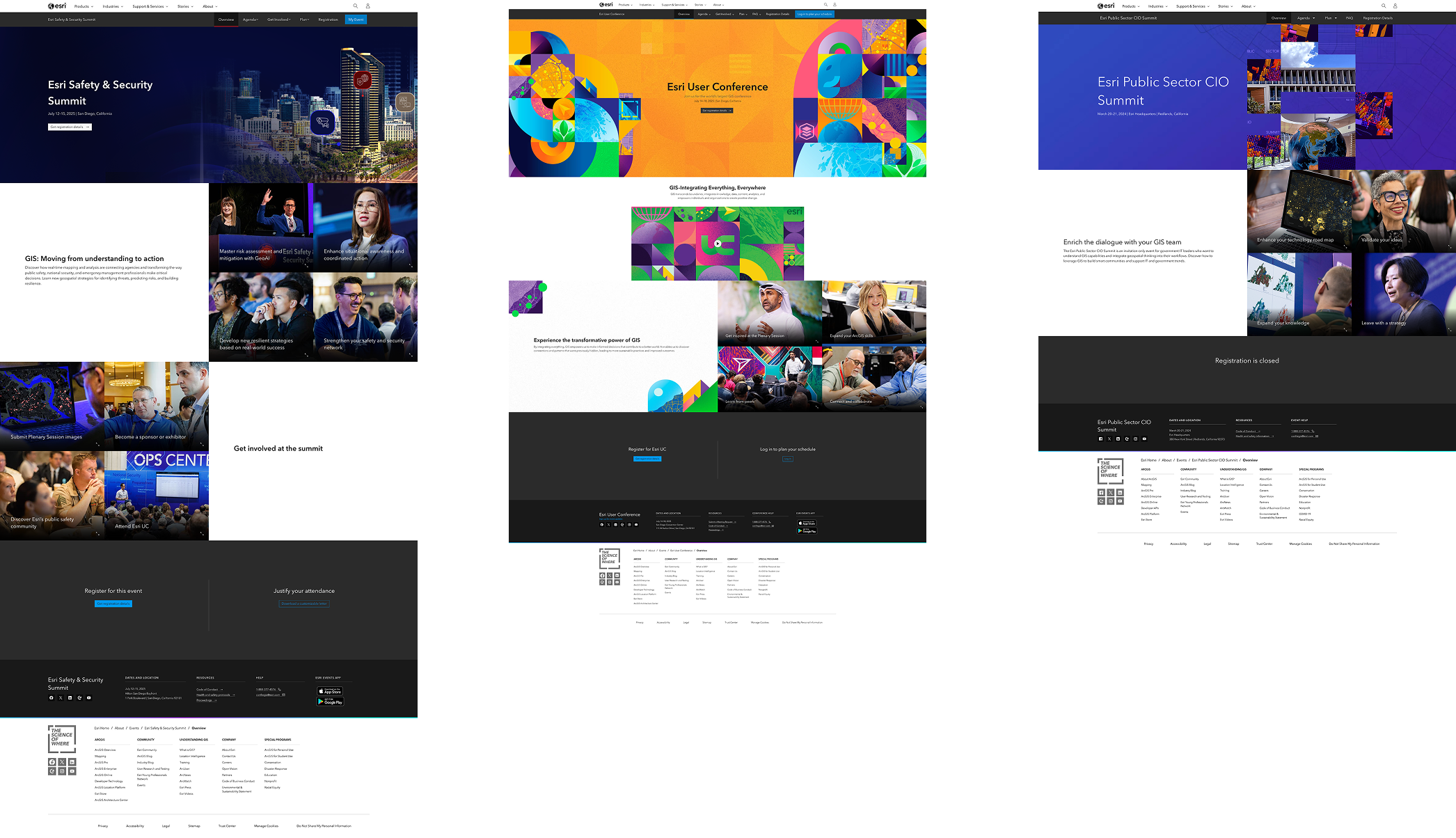
Through page audits and conversations with stakeholders, recurring patterns emerged:
- Event offerings had evolved beyond what the template was originally designed to support.
- Different types of content were competing for attention within the same component.
- Important event experiences lacked dedicated placement on the page.
- Existing promotional components introduced accessibility issues.
- The template no longer reflected the quality and scale of modern Esri events.
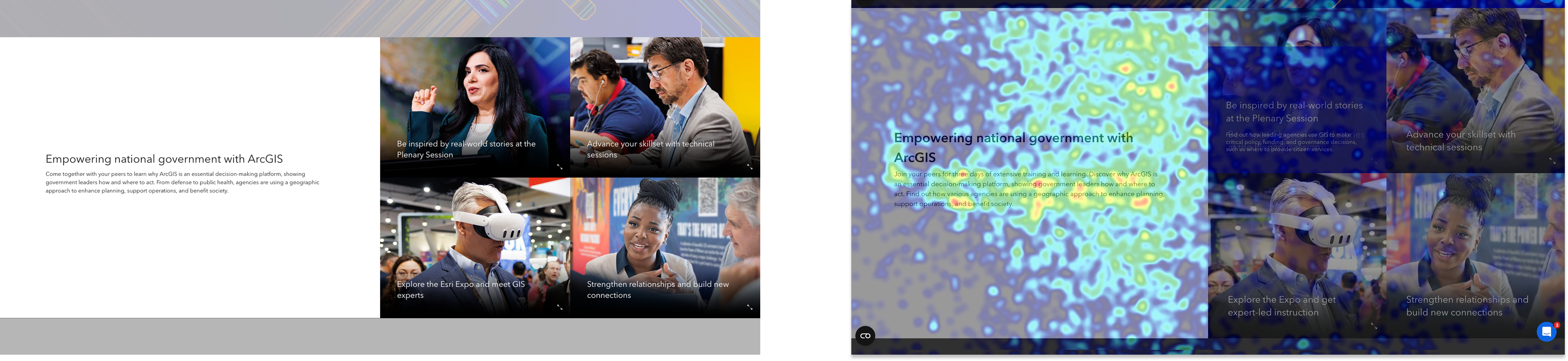
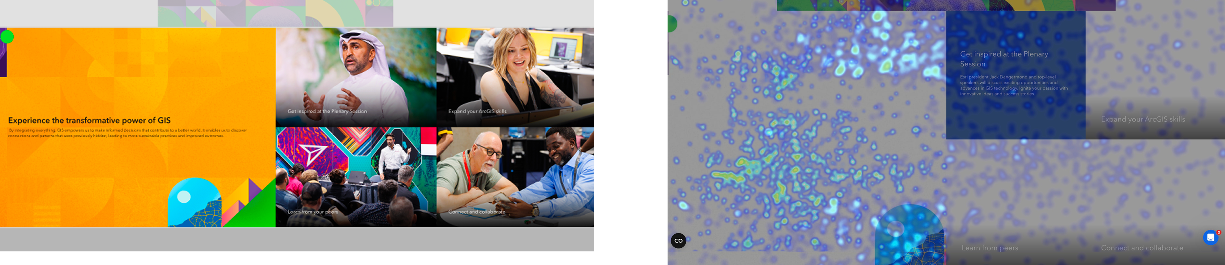
Mouseflow data added another signal. Across event pages, movement patterns showed little activity over the four promotional tiles, including tiles that contained links to additional information. We were already aware that the component introduced accessibility concerns because important content depended on hover interactions and small linked text. The behavioral data reinforced that the component was not encouraging discovery or interaction.
Design Goals
The redesign focused on creating a reusable template that balanced attendee needs, business goals, and long-term maintainability.
The primary goals were to:
Primary System Objectives
- Help attendees quickly discover event content and activities.
- Better showcase what makes each event unique.
- Improve accessibility and content discoverability.
- Separate unrelated content into clearer information groups.
- Create a modular template that could scale across events of different sizes.
- Establish stronger pathways into the attendee portal for detailed planning.
Collaboration & Discovery
Before exploring layouts, I worked closely with stakeholders and the build team to understand both content needs and technical feasibility.
Together we:
- Mapped existing components against current content needs.
- Identified missing content patterns.
- Evaluated which existing components could be reused.
- Discussed technical limitations within the existing AEM component library.
- Prioritized solutions that could scale across all events instead of solving for individual websites.
These conversations helped ensure design decisions were both user-centered and realistic to implement.
Exploring Design Directions
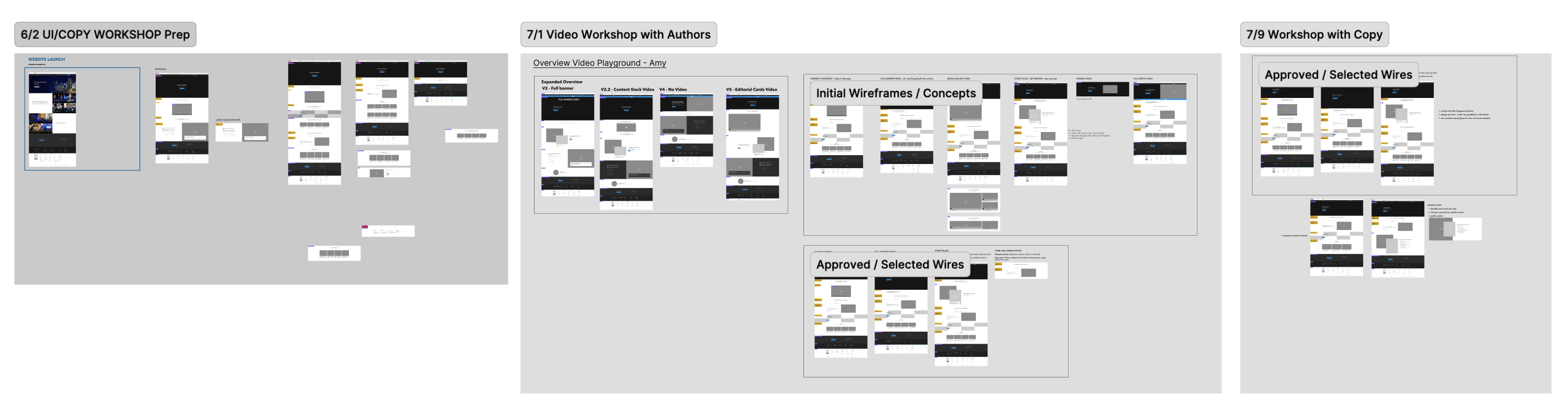
Several concepts were explored before arriving at the final solution.
Single-Page Layout
One direction focused primarily on reorganizing the existing page into a cleaner single-page experience. While it improved hierarchy, it did not fully solve the underlying issue of mixed content types.
Video-Led Experience
Another concept introduced a large video banner to better showcase the atmosphere and energy of Esri events. Although promising, the concept required additional coordination with the video team and exceeded the project's implementation scope, making it a candidate for future exploration.
These explorations reinforced an important insight:
"The problem wasn't that the page needed more content—it needed a better framework for organizing content."
Designing a Flexible Content Framework
The most impactful design decision was breaking apart the overloaded four-tile component.
Instead of grouping unrelated information together, the new template organized content into distinct sections based on purpose.
Previously bundled content was separated into dedicated areas for:
- Core event value propositions
- Featured event experiences
- Audience highlights
- Sponsor and exhibitor information
- Related calls to action
This created a clearer information hierarchy, improved scanability, and gave stakeholders dedicated spaces for different content types instead of forcing everything into a single component.
Additional improvements included:
- Reordering sections to better match attendee priorities.
- Introducing modular content sections.
- Adding iconography to improve visual recognition.
- Improving calls to action leading into the attendee portal.
- Creating stronger connections between marketing content and detailed planning experiences in RainFocus.
Designing for Scale
Because this template would support many different events, flexibility became just as important as usability.
The redesigned template introduced modular content sections that could be added or removed depending on each event's needs.
Examples included:
- Optional promotional content strips for featured initiatives.
- Flexible tab navigation supporting three to five categories.
- Reusable content modules that allowed larger conferences to showcase additional programming while keeping smaller events focused and concise.
Rather than creating one perfect page, the goal was to create a system that could adapt to a wide range of event experiences while maintaining a consistent user experience across the portfolio.
Constraints
Although the redesign significantly modernized the experience, several constraints shaped the final solution.
System & Technical Constraints
- The project needed to remain within the existing AEM component library.
- Creating entirely new custom components was outside project scope.
- The video banner concept was postponed due to implementation scope and cross-team dependencies.
- The template needed to remain reusable across dozens of events with varying content needs.
Design decisions were made with long-term maintainability and scalability in mind.
Final Outcome
One system, adapted across events
The redesigned Overview template created a shared foundation that could flex around each event's content, audience, and priorities.
- Adopted as the reusable Event Overview template
- Improved flexibility for organizing event-specific content
- Addressed accessibility and discoverability concerns in the previous template
- Positive feedback from content authors and copy editors
Reflection
This project pushed me to think beyond a single page and consider how a design needs to work across many events, content needs, and internal teams.
As I worked through the existing template, I saw how easily a flexible component can become overloaded as new needs emerge. That influenced how I approached the redesign. Instead of finding new places for the same content, I focused on giving different types of content a clearer purpose and structure.
Seeing the template roll out across events of different sizes reinforced the value of designing with flexibility from the beginning. It's an approach I've continued to bring to my work, especially when designing experiences that need to scale across teams and platforms.