Overview
As part of Esri's Events Optimization Initiative, I redesigned the Become a Sponsor page used across multiple event websites. While the page successfully centralized sponsorship information, it had become increasingly content-heavy, making it difficult for prospective sponsors to quickly understand the value of sponsoring an event or locate important resources.
The redesign needed to improve usability while remaining flexible enough to support different sponsorship offerings across multiple events. Because the experience was built in Adobe Experience Manager (AEM), the solution also had to work within existing CMS components and be easy for the marketing team to configure without ongoing design support.
The Challenge
The existing page attempted to answer nearly every sponsorship question in one place. Large portions of content duplicated information already available in the sponsorship prospectus, including lengthy sponsorship package listings and operational details.
As additional events adopted the template, this approach became increasingly difficult to maintain. Marketing teams had to manually duplicate and update content across multiple locations, while prospective sponsors were required to navigate dense pages before finding the information they cared about most.
This resulted in three core challenges:
- Low scannability due to lengthy, repetitive content.
- An unclear value proposition because key benefits and actions were buried within supporting information.
- Increased setup and maintenance effort caused by duplicated content across multiple sources.
The challenge was to simplify the experience without sacrificing flexibility, creating a framework that could scale across events with varying sponsorship offerings.
Understanding the Problem
To understand where improvements would have the greatest impact, I combined multiple research methods.
I conducted content audits to identify duplicated information and opportunities to streamline the page. I also met with stakeholders to understand business requirements across different event types and collaborated with the AEM authoring team to validate what could realistically be supported within the existing component library.
To complement this qualitative research, I reviewed Adobe Analytics to understand how prospective sponsors interacted with the page. Analytics revealed that high-value resources, such as the Expo Floorplan, were among the most frequently accessed items despite being positioned near the bottom of the page.
Together, these findings highlighted opportunities to improve both the sponsor experience and the internal authoring workflow.
Constraints
Several constraints shaped the direction of the redesign.
The page was built in Adobe Experience Manager using predefined components, limiting opportunities to introduce entirely new layouts or custom interactions. Content would continue to be managed by the marketing team, making ease of authoring just as important as the end-user experience.
The solution also needed to support multiple events with different sponsorship offerings, requiring a flexible structure that could be configured without redesigning the page for each event.
Rather than introducing new components, I focused on improving how content was organized within the existing CMS framework.
Design Goals
The redesign centered around four objectives:
Primary Objectives
- Improve page scannability.
- Strengthen content hierarchy.
- Simplify the overall content structure.
- Reduce setup and maintenance effort for internal teams.
Prioritizing High-Value Actions
Adobe Analytics helped identify the actions sponsors engaged with most frequently.
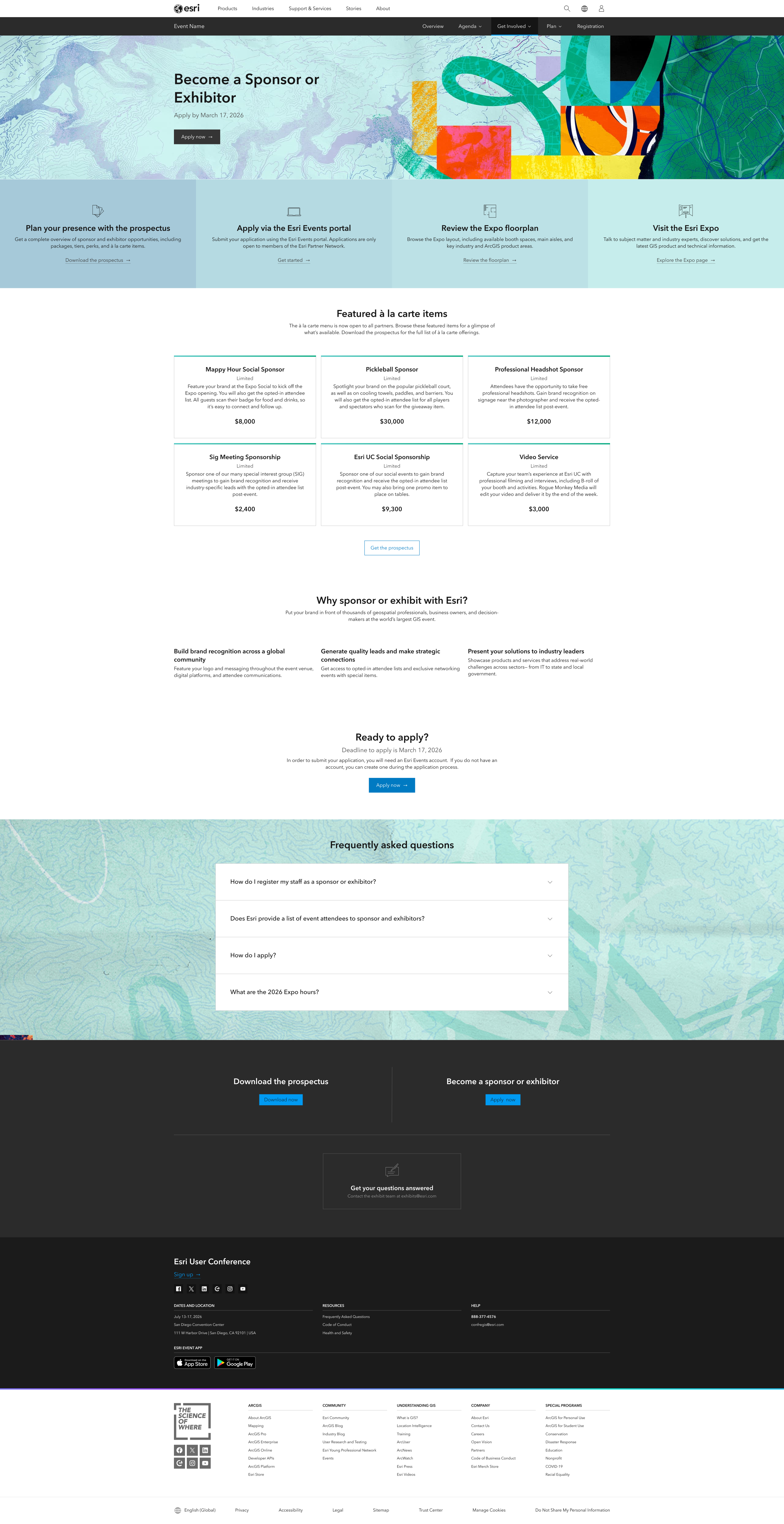
One key insight was that the Expo Floorplan consistently received high engagement despite being located near the bottom of the page. Based on this finding, I reorganized the page hierarchy by moving the most valuable resources higher on the page and grouping them together within a more prominent call-to-action section.
This established a clearer visual hierarchy and surfaced important actions earlier in the sponsor journey.
Reducing Content Density
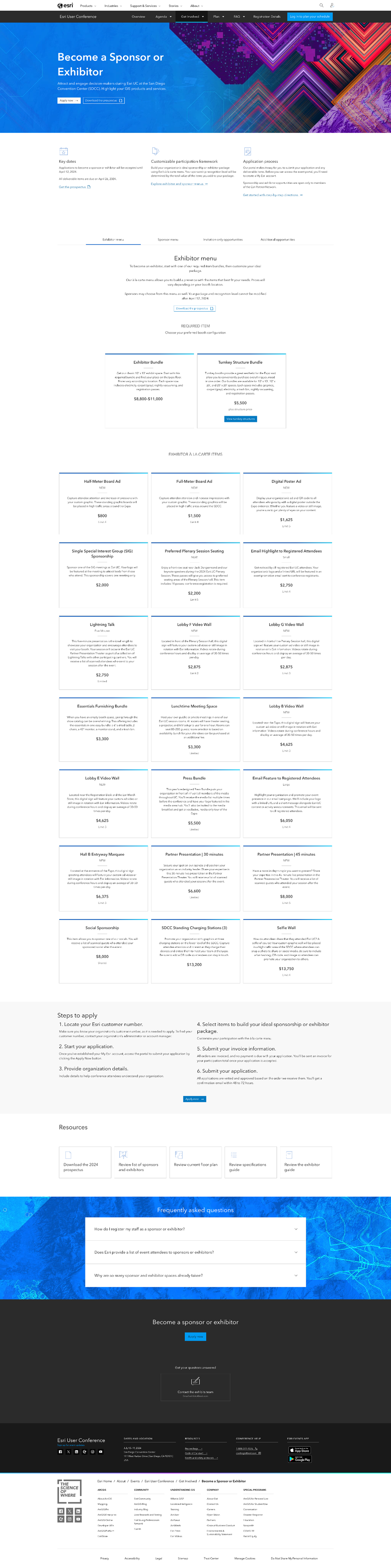
The original page relied heavily on long sections of repeated information, making it difficult to quickly understand sponsorship opportunities.
I simplified the experience by reducing the number of sponsorship packages displayed directly on the page and removing information that already existed within the sponsorship prospectus.
Operational details, such as setup information and exhibitor hours, were relocated to the FAQ, shortening the page while keeping supporting information accessible when needed. These changes created a more focused experience that emphasized the value of sponsoring rather than overwhelming users with documentation.
Communicating the Value of Sponsorship
Simplifying the page also created an opportunity to give prospective sponsors a clearer understanding of why they might want to participate. This came together as two related but distinct improvements: a dedicated place to explain the value of sponsoring, and a flexible way to back that value up with evidence.
Dedicated Benefits
I introduced a dedicated benefits section, giving every event a consistent place to communicate the value of sponsorship without relying on lengthy package descriptions.
Flexible Social Proof
Alongside the benefits section, I introduced a flexible social proof area that could adapt to the strongest supporting content available for each event, whether that was a sponsor quote, video story, or standout event numbers.



Together, these sections gave the page a clearer progression from understanding the value of sponsorship to exploring opportunities and taking action.
Creating a Modular Framework
The page needed to work across events with different sponsorship programs, available content, and business needs.
Rather than creating unique layouts for individual events, I reorganized the experience around reusable and optional content sections.
The framework included:
- A consistent benefits section.
- Flexible social proof options.
- Optional sponsorship package sections that could expand or contract depending on event needs.
- Consistent placement of high-value resources.
- Consistent placement of primary calls to action and FAQs.
Marketing teams could configure the page using different combinations of these sections while maintaining a recognizable structure across the broader event portfolio.
This gave individual events flexibility without requiring a new page design each time their sponsorship needs differed.
Designing Across the Sponsorship Lifecycle
The sponsorship experience also needed to work before applications opened.
Previously, prospective sponsors were directed to a notification form on the event Overview page. While this provided a way to register interest, it gave users little context about the value of sponsorship or what they could expect next.
I introduced a dedicated Notify Me phase for the Become a Sponsor page. Instead of removing the sponsorship experience when applications were not yet available, the page could remain live and continue communicating relevant sponsorship information.
During the Notify Me phase, prospective sponsors could:
- Learn about the benefits of sponsoring.
- Explore relevant supporting content.
- Understand that sponsorship opportunities were not yet open.
- Register their interest through a clear Notify Me action.
Once applications opened, the same page could transition into the active sponsorship experience with updated calls to action and supporting content. This created a more continuous sponsorship journey and gave prospective sponsors a meaningful next step regardless of when they arrived on the page.
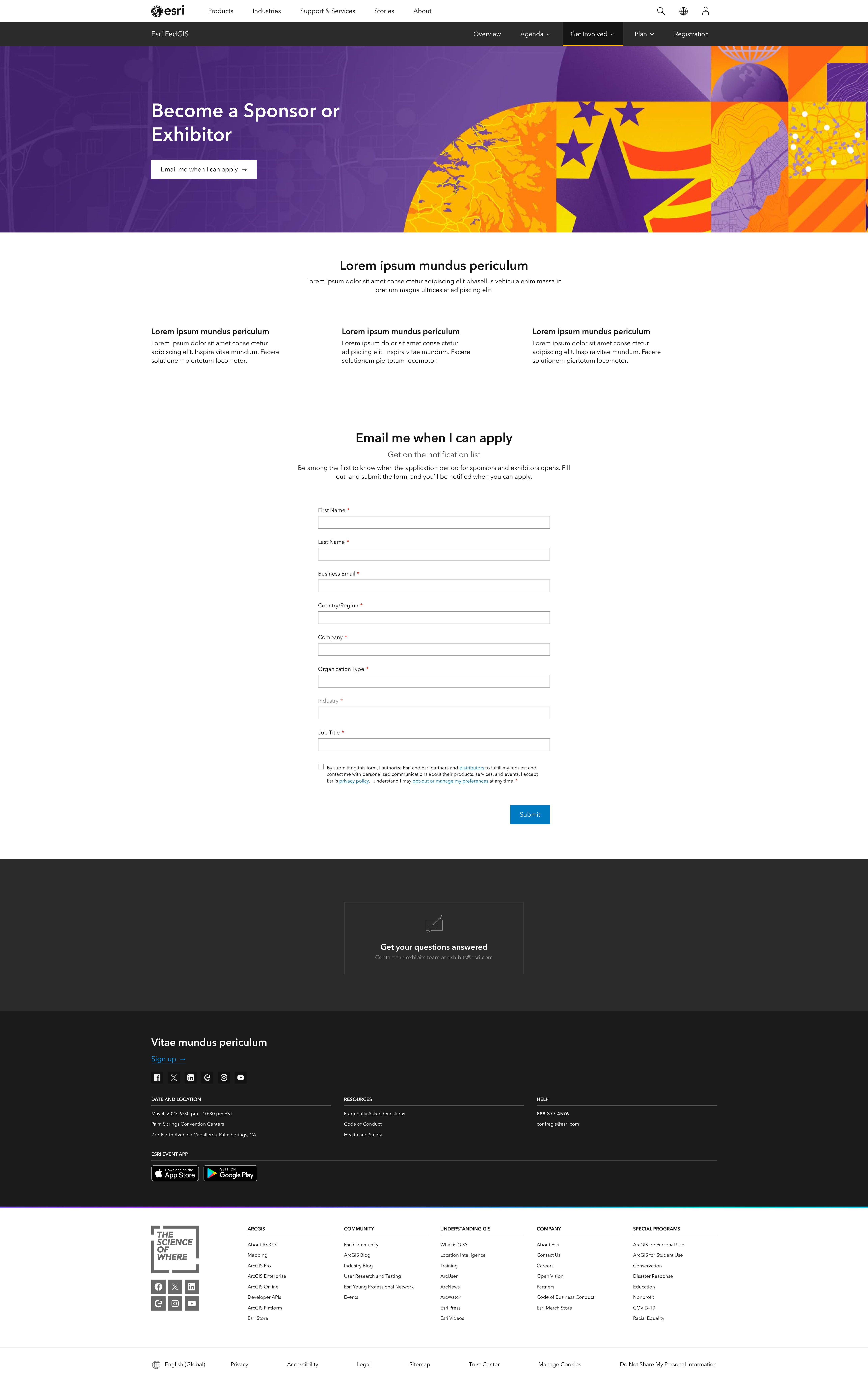
- Communicates sponsorship value before applications are available.
- Gives prospective sponsors a clear next step through email notification signup.
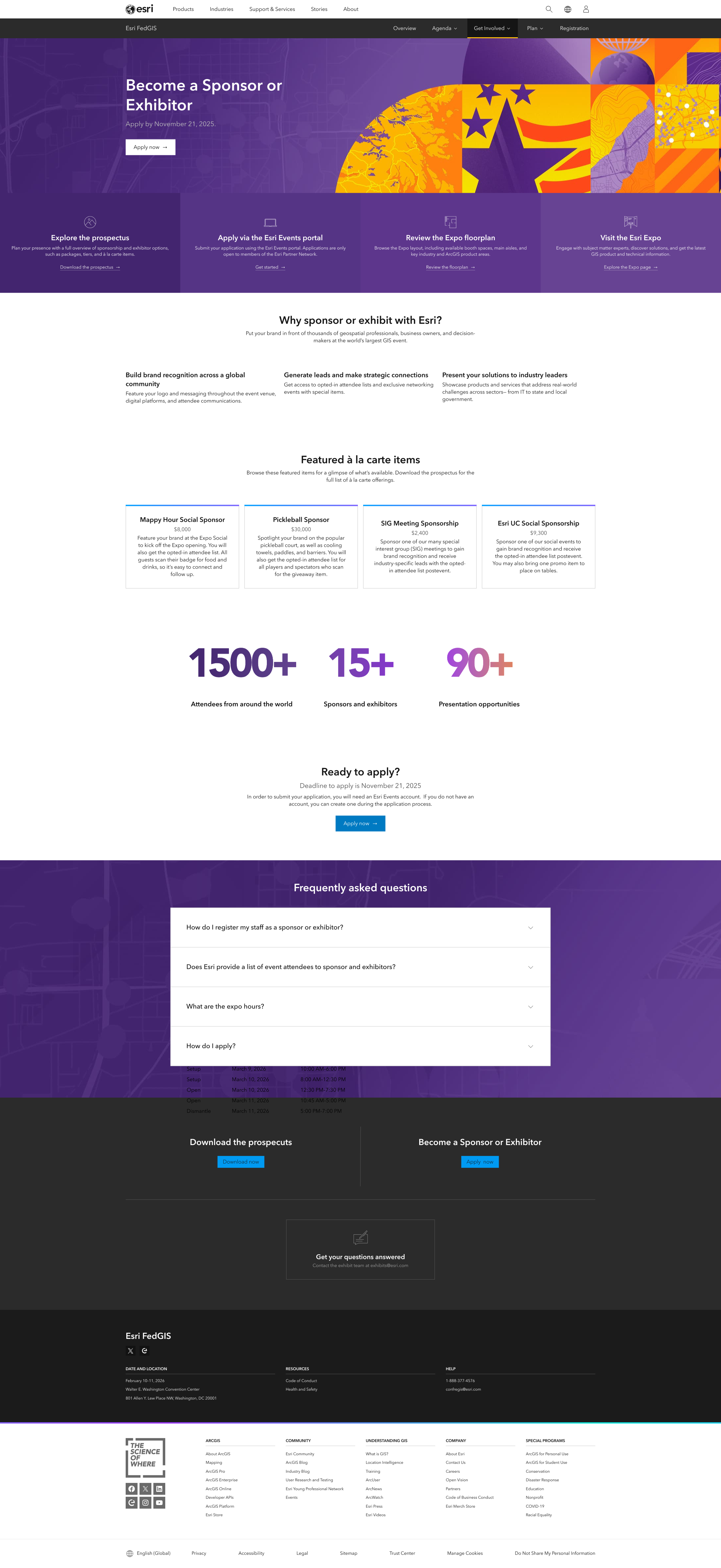
- Surfaces sponsorship opportunities and supporting resources.
- Shifts the primary action from notification signup to applying.
The page structure could adapt to the current phase while maintaining a consistent destination for prospective sponsors.
Designing for Implementation
Although another team implemented the experience in Adobe Experience Manager, I provided detailed documentation describing page structure, expected component behavior, content requirements, and interaction patterns.
This included guidance for how reusable and optional sections could be configured across events, as well as how the experience should adapt between sponsorship phases.
Section & Component Documentation
Page anatomy documentation breaking the template into its reusable and optional components — banner, elastic content strip, benefits section, testimonial/social proof section, package cards, FAQ, and the Notify Me form — so authoring teams could see how each section could be configured.
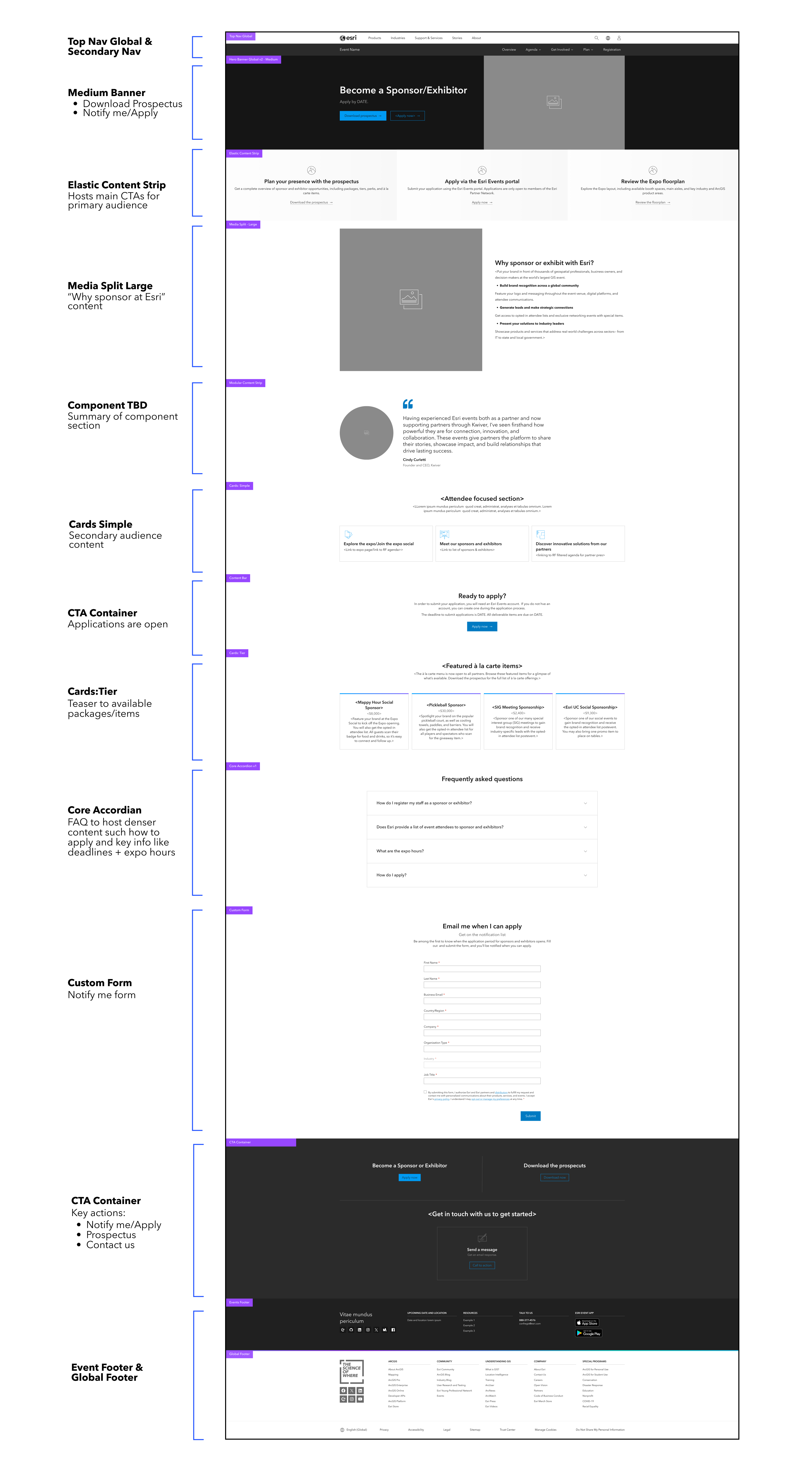
Sponsorship Phase Documentation
Documentation covering each sponsorship phase — Notify Me (pre-event), Applications Open, Applications Closed, and Notify Me (post-event) — with the purpose and content goals for each state.

Throughout the project, I collaborated closely with the copy team to align content with the revised information architecture and partnered with the AEM authoring team to validate implementation feasibility within the existing CMS.
This collaborative process ensured the final design balanced user needs, business goals, and technical constraints.
Outcome
The redesigned Become a Sponsor experience established a scalable framework that could adapt across both different events and different stages of the sponsorship lifecycle.
The final experience:
- Improved content hierarchy by surfacing high-value actions earlier.
- Increased scannability through simplified, more focused content.
- Reduced duplicated information across sponsorship resources.
- Created dedicated space for communicating sponsorship benefits.
- Introduced flexible social proof options using quotes, video, or key data.
- Allowed the sponsorship page to remain useful before applications opened through a dedicated Notify Me phase.
- Introduced a modular page structure that could scale across multiple events.
- Simplified authoring through reusable CMS components and a more consistent content framework.
While quantitative performance metrics are not currently available, the redesign created a repeatable template that continues to support multiple event websites as part of Esri's broader Events Optimization Initiative.