Overview
Carmichael HART is a nonprofit organization that provides housing support, outreach, and community services for individuals experiencing homelessness in Carmichael, California.
The organization's website serves as a primary resource for people seeking assistance, volunteers looking to get involved, and community members interested in supporting its mission. Over time, the site had become outdated, difficult to navigate, and increasingly challenging for staff to maintain.
Over a two-week freelance engagement, I led the end-to-end redesign of the website—from discovery and information architecture through implementation in Wix—to create a more intuitive experience for visitors while reducing ongoing maintenance for the organization.
The Challenge
The existing website no longer reflected the organization's growth or effectively supported the needs of its primary audiences.
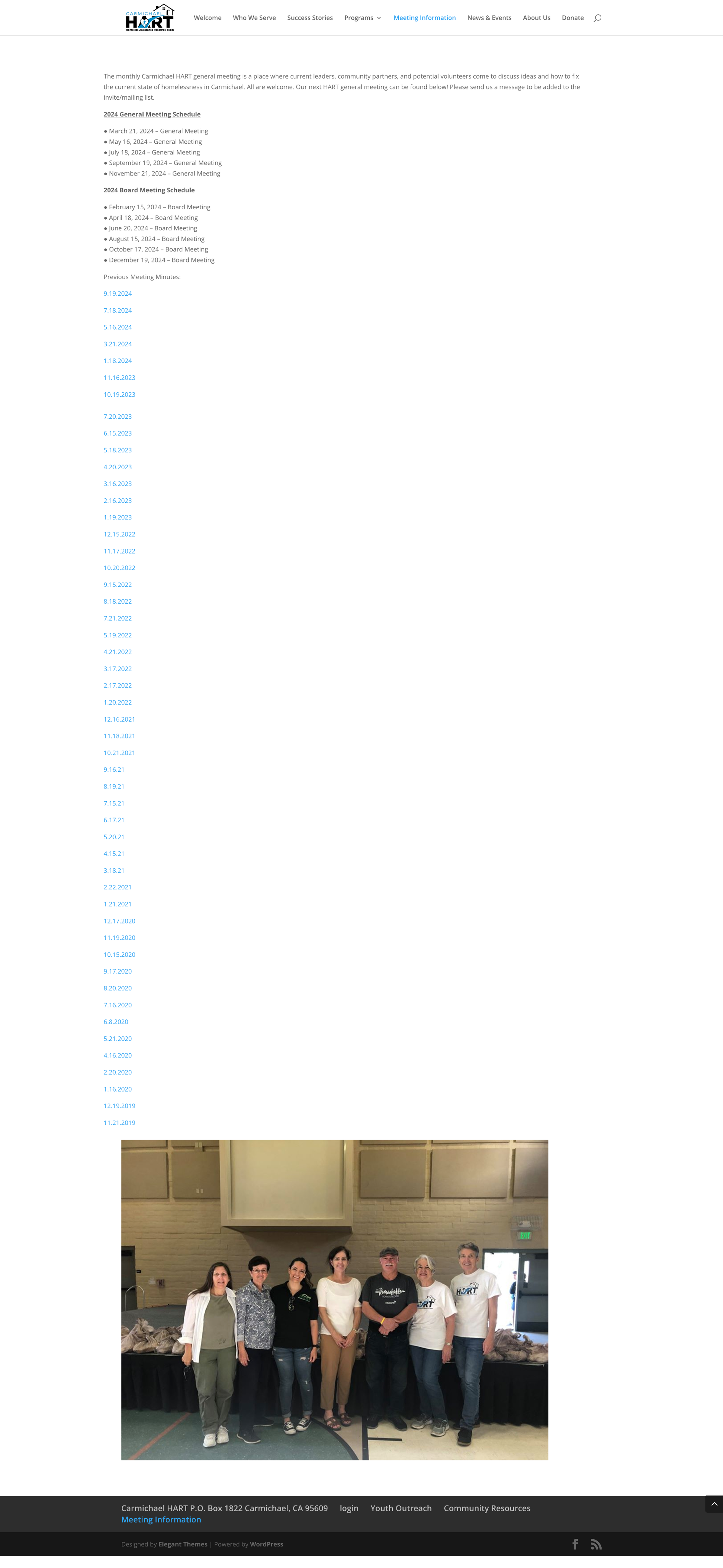
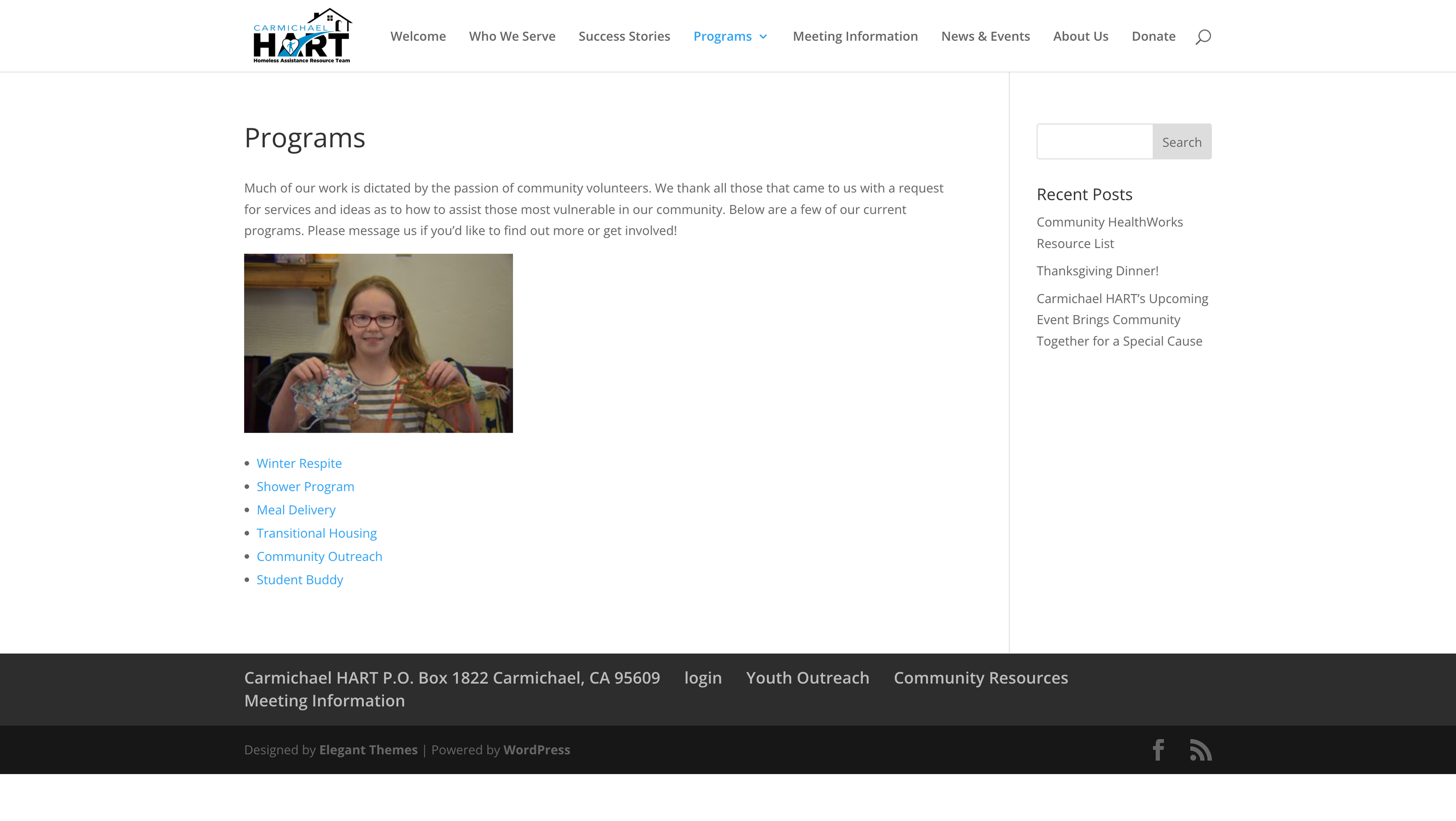
Visitors struggled to locate important information due to an overcrowded navigation structure and an information architecture that had evolved organically over time. At the same time, staff spent unnecessary effort maintaining content, with routine updates sometimes leaving outdated information visible on the website.
The redesign needed to improve usability while creating a sustainable foundation that the organization could realistically maintain moving forward.
Constraints
Like many nonprofit organizations, the project required balancing usability improvements with practical operational constraints.
Constraints
- The redesign needed to remain within Wix's platform capabilities.
- The project timeline was limited to two weeks, requiring focus on the highest-impact improvements.
- Some existing content, such as success stories, was outdated and could not be rewritten before launch.
- The organization needed reusable templates while still allowing flexibility for programs with unique content requirements.
These constraints shaped both the design strategy and implementation approach.
Discovery
Content Audit
Before exploring design solutions, I reviewed every page of the existing website (approximately 15–18 pages) to better understand how information was organized and how visitors navigated through the site.
The audit revealed several recurring issues:
- Too many top-level navigation items created unnecessary complexity.
- Related information was spread across multiple pages.
- Important pathways for volunteers and donors lacked visibility.
- Meeting information was manually maintained on the homepage, occasionally leaving outdated information visible.
- The site's overall structure no longer reflected the organization's priorities.
Defining the Information Architecture
The redesign began by reorganizing the site's structure around the organization's primary audiences instead of its internal organization.
Primary Audiences
- Volunteers
- Donors
- People seeking assistance
This audience-first approach informed both the sitemap and the placement of key content throughout the website.
Design Exploration
Rather than moving directly into high-fidelity designs, I explored multiple approaches for organizing content and establishing visual hierarchy.
Early iterations focused on:
- Simplifying navigation
- Exploring homepage content placement
- Prioritizing high-value actions
- Creating clearer pathways for volunteering, donating, and requesting assistance
These explorations helped validate the information architecture before moving into detailed interface design.
Simplifying Navigation & Information Architecture
The site's navigation was reorganized to reduce complexity and make important actions easier to find.
Rather than simply reducing menu items, I restructured the sitemap to group related information together, creating a clearer hierarchy that better aligned with visitors' goals.
This allowed users to locate programs, volunteer opportunities, and organizational information with fewer decisions.


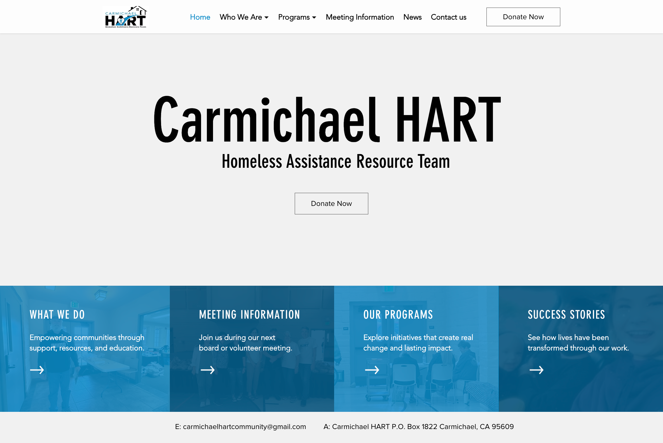
Reduced top-level navigation · Related content grouped into dropdowns · Clearer Donate CTA
Designing a More Trauma-Informed Experience
The previous experience separated organizational information from information about the people Carmichael HART serves. The "Who We Serve" page also relied heavily on statistics, distress-focused imagery, and deficit-based descriptions of homelessness.
I combined the two pages into a single About experience and restructured the content around Carmichael HART's mission, its work, the communities it serves, and the organizations that support that work.
The redesign took a more trauma-informed approach to content and presentation, reducing fear-based framing and creating a more respectful, contextual way to communicate who the organization serves.
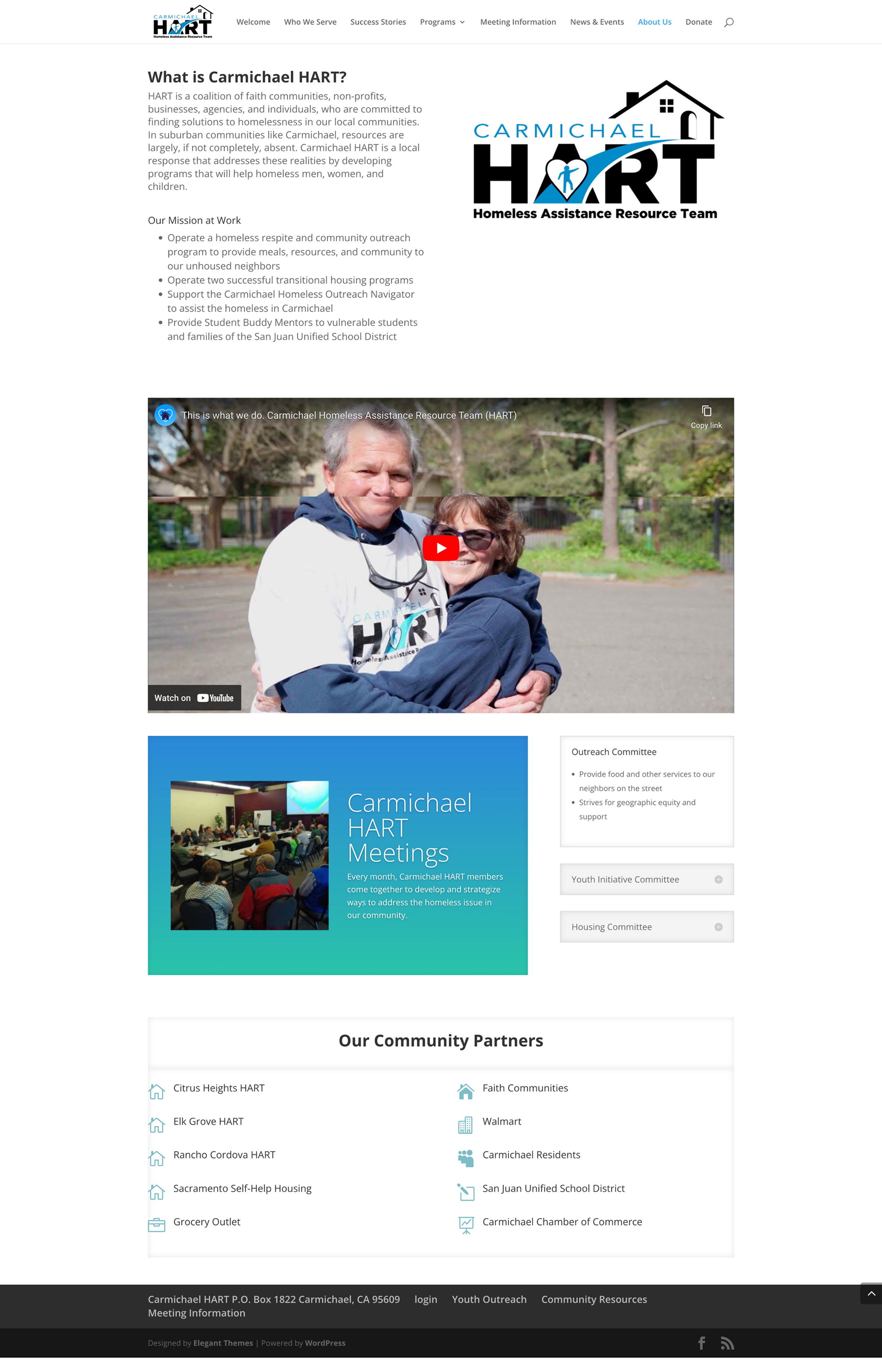
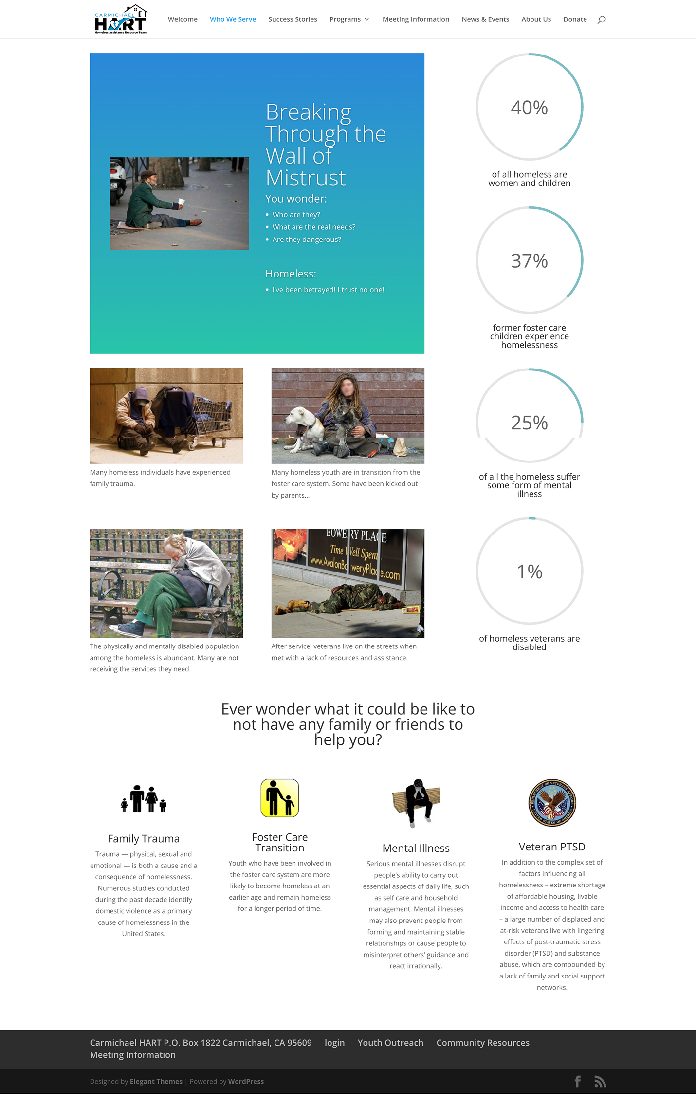
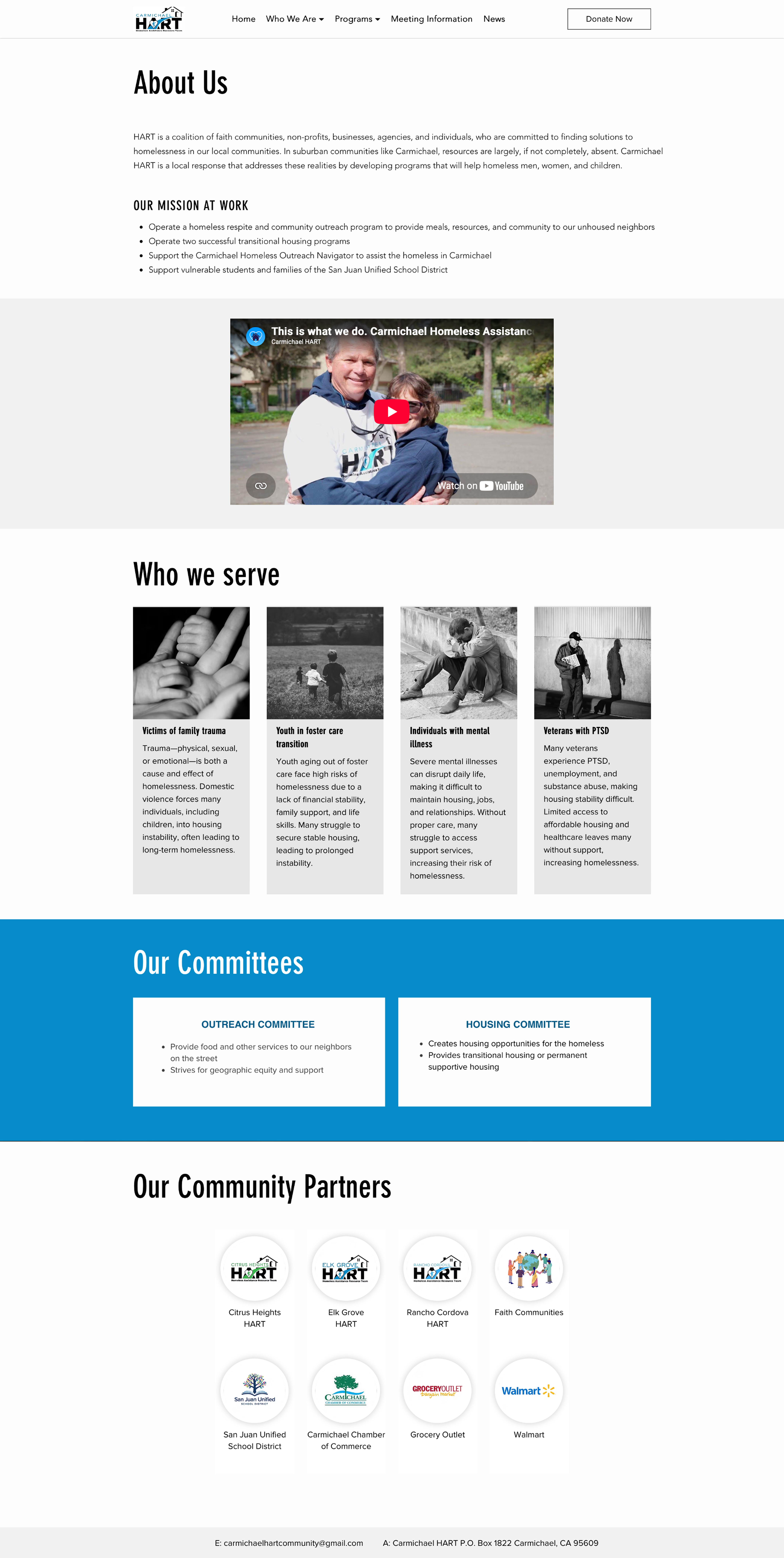
Reframed the page around who Carmichael HART is and the work it does.
Reduced reliance on distress imagery, statistics, and fear-based messaging when describing people experiencing homelessness.
Created a more intentional progression from mission → work → who we serve → committees → community partners.
Combined two overlapping pages into one clearer destination, reducing fragmentation in the site architecture.
Creating a Clearer Homepage Experience
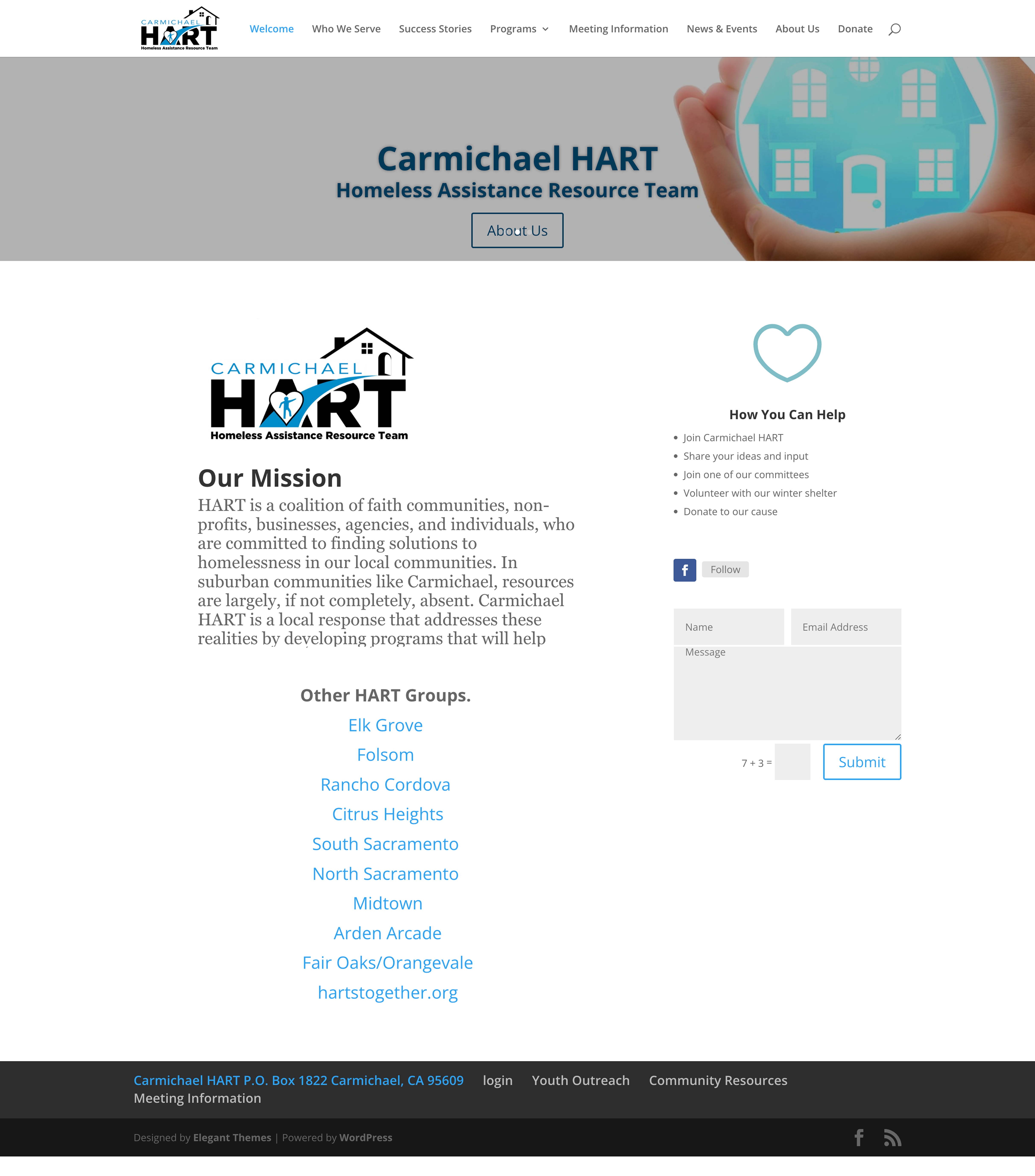
The homepage shifted from serving as a collection of organizational information to acting as a decision point for visitors.
Content was reorganized around the needs of the site's primary audiences, helping users quickly identify where they needed to go while improving overall scanability and visual hierarchy.
Reducing Operational Overhead
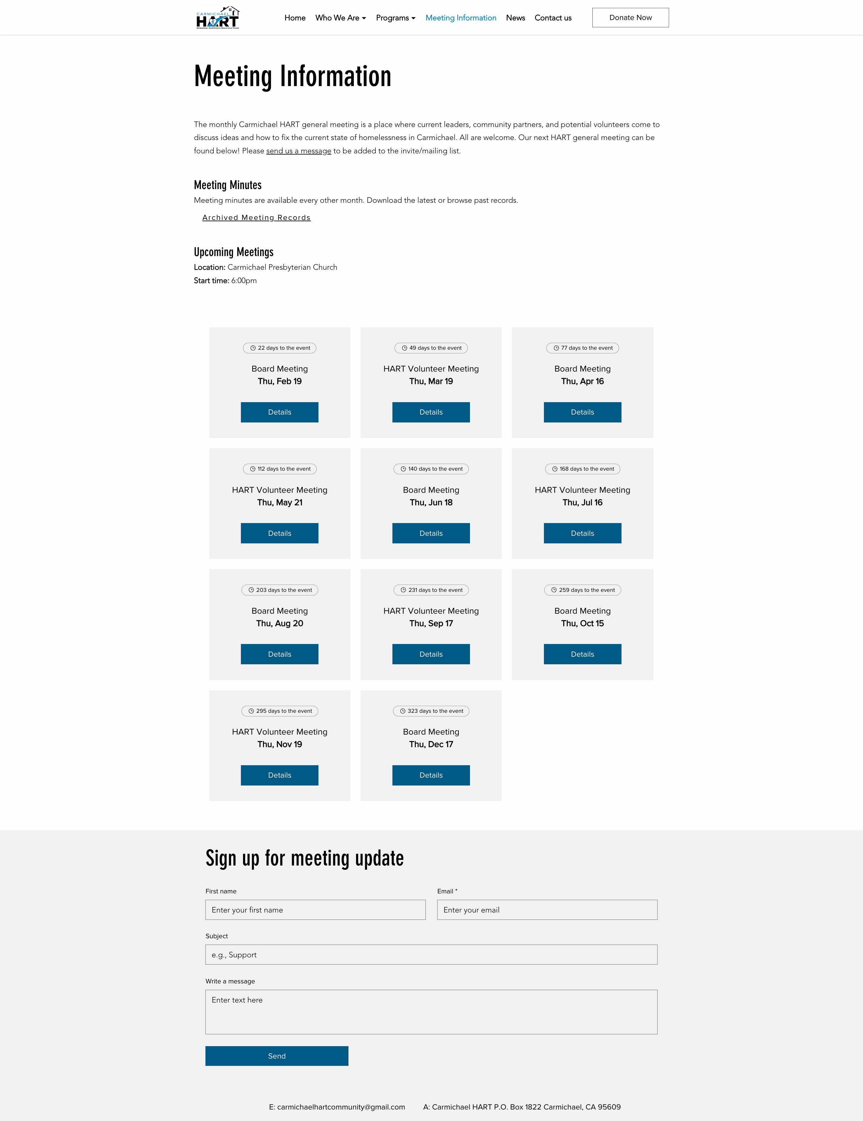
One recurring maintenance challenge involved keeping meeting information current.
Previously, staff manually updated meeting details directly on the homepage, which occasionally resulted in outdated information remaining visible.
To improve long-term maintainability, I implemented a reusable Wix solution that allowed meeting information to be managed from a single location. This reduced repetitive updates while making it easier for staff to keep information accurate over time.
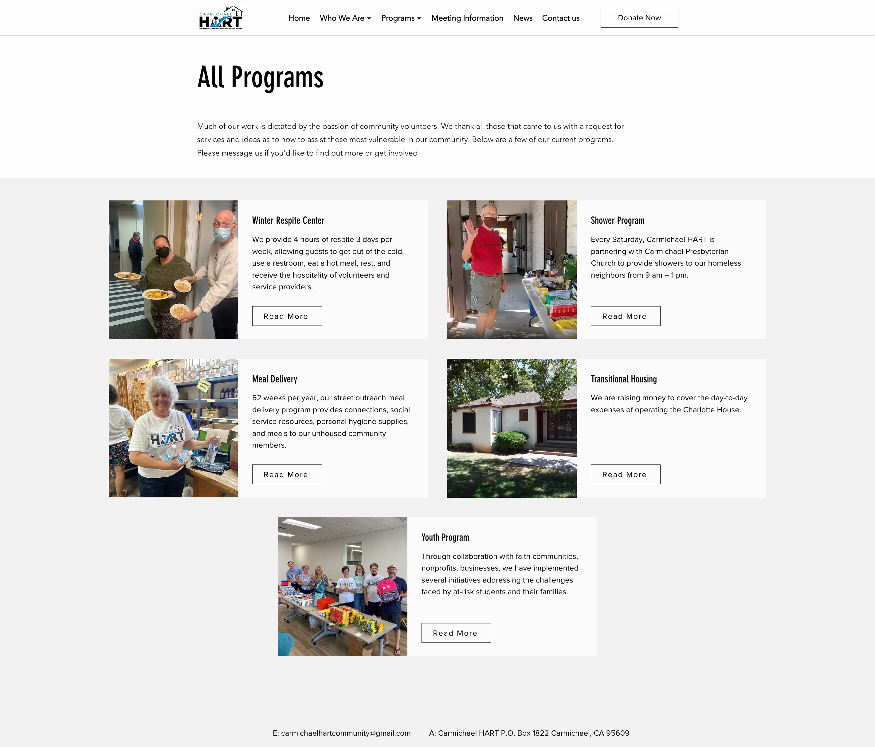
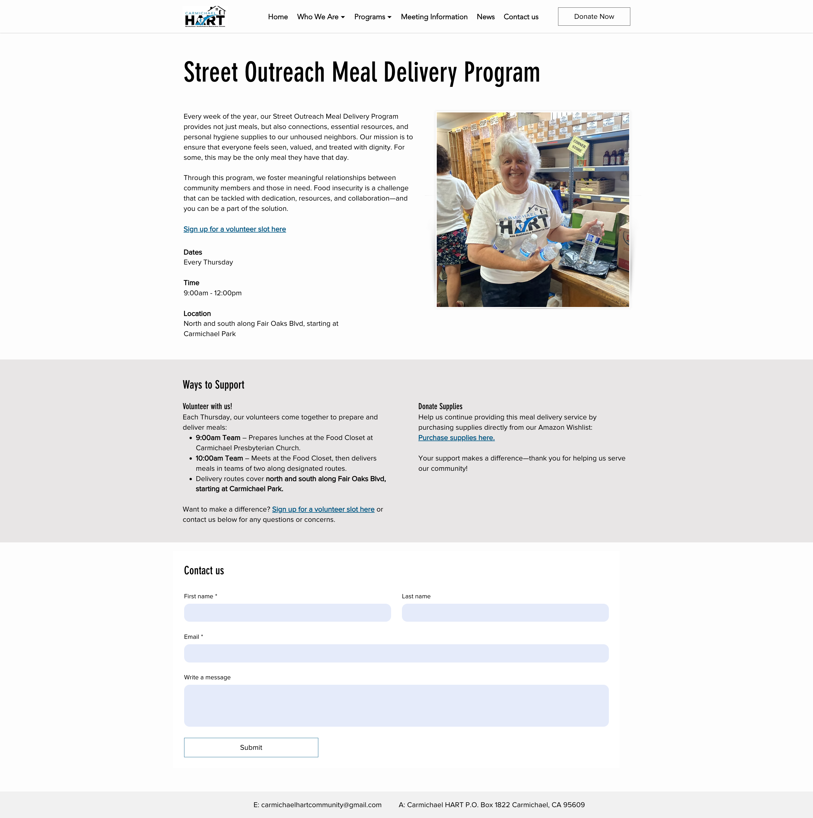
Designing Flexible Program Templates
To support future growth, I created reusable page templates that established a consistent foundation while allowing flexibility where individual programs required unique layouts or content.
The templates improved consistency across the website while giving staff the freedom to adapt pages without starting from scratch.
Outcome
The redesign created a more intuitive experience for visitors while reducing the operational effort required to manage the website.
Visitor Experience
- Simplified navigation made information easier to discover.
- Clearer pathways encouraged more people to contact the organization for assistance.
- Volunteer and donation opportunities became more prominent and easier to find.
Staff Experience
- Centralized meeting management reduced manual updates.
- Reusable templates simplified future content creation.
- The website became easier to maintain within existing staff resources.
Impact
Following the redesign, Carmichael HART saw measurable changes in how people engaged with the organization through the website.
The redesigned site also reduced manual maintenance, giving staff a more sustainable foundation for managing content as the organization continued to grow.
Measurement: Impact was evaluated by comparing volunteer questions, donations, and service inquiries from the six months before and six months following the redesign.
Reflection
This project reinforced that successful nonprofit websites need to support both the people using them and the teams maintaining them.
By approaching the redesign through content strategy, information architecture, UX design, and implementation, I was able to deliver more than a visual refresh. The result was a website that improved discoverability, reduced operational overhead, and provided a scalable foundation the organization could continue building upon.