
Digital Agenda Wall
Designing Real-Time Event Navigation for Thousands of Attendees
The Digital Agenda Wall is a real-time Event Information Display System used at large-scale conferences, helping attendees navigate sessions across multiple venues. By enhancing clarity and prioritizing key information, the redesigned experience ensured attendees could confidently find and plan their sessions.
My Role
UX Design
Team
UI Designer, Developer, Project Stakeholders
Core Skills
Stakeholder communication, cross-functional collaboration, product thinking, QA support
Tool

Implemented design of the Digital Agenda Wall for onsite events.
The Challenge
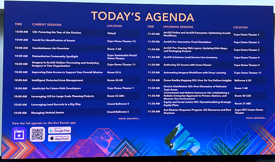
Stakeholders tasked us with improving the readability and usability of the agenda wall, while ensuring the final design remained technically feasible. The goal: present clear, actionable information tailored to attendee needs without overloading the display.
Original design for the Digital Agenda Wall
Key usability issues identified
-
Hard-to-scan stacked session names and locations due to text wrapping.
-
Dense layout with minimal spacing, creating cognitive overload.
-
Distracting app promotions diverting attention from the agenda.
-
Lack of location-specific context in a multi-venue environment.
ORIGINAL DESIGN

Process & Iterations
Simplifying & Structuring
Session scrolling:
Recommended showing one time slot at a time to reduce repetition and cognitive load.
QR Code:
Removed unnecessary icons to highlight QR code for clear download directions

Highlights section:
Introduced a dedicated area for long-running activities (such as registration or expo halls) to prevent them from cluttering the session list.
Final Design: Cleaner, Smarter, Feasible
Live onsite display of implemented design.
Working closely with the developer and UI designer, I finalized:
Hierarchy improvements
Moved session time and location details to the end of the title, eliminating awkward text wrapping.
Consistent Highlights
Kept the well-received highlights component from earlier iterations.
Layout refinements
Retained the clean, familiar structure but tweaked spacing, alignment, and grouping for better scannability.
QA Support
Partnered with the developer to thoroughly test the product pre-launch, ensuring visual accuracy and performance.
Outcome & Impact
-
Increased session readability and reduced attendee confusion.
-
Successfully balanced stakeholder goals and technical constraints.
-
Delivered a scalable, clean design aligned with attendee needs.
-
Final design launched smoothly and functioned effectively on-site.
Key Strengths Demonstrated
-
Stakeholder Communication: Translated feedback into actionable design decisions, kept communication clear throughout.
-
Cross-Functional Collaboration: Partnered closely with UI and development teams, ensuring smooth handoff and QA.
-
Product Thinking: Focused on user needs, technical feasibility, and long-term scalability.
-
Problem Solving: Thought critically about system limitations and proposed practical, user-centered solutions.